I spent several hours yesterday working with Branislav, Cathy and the AI to do another round of cleaning up C-LARA’s presentation. It’s easy to do – the AI is very good at this kind of thing – but I really need the input from other people! Since I’m the one who’s closest to the code, it all looks obvious to me and I can’t see the problems. Though when other people point them out I can 🙂
We made a great many small changes, here are the most important ones. If you don’t have C-LARA bookmarked, go here to try these things out yourself.
Top-level menus
The menu you see before logging in looks like this:
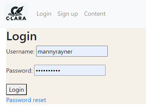
The ‘Content’ tab goes to the public content page, where you can browse content without logging in.
The menu after logging in looks like this:
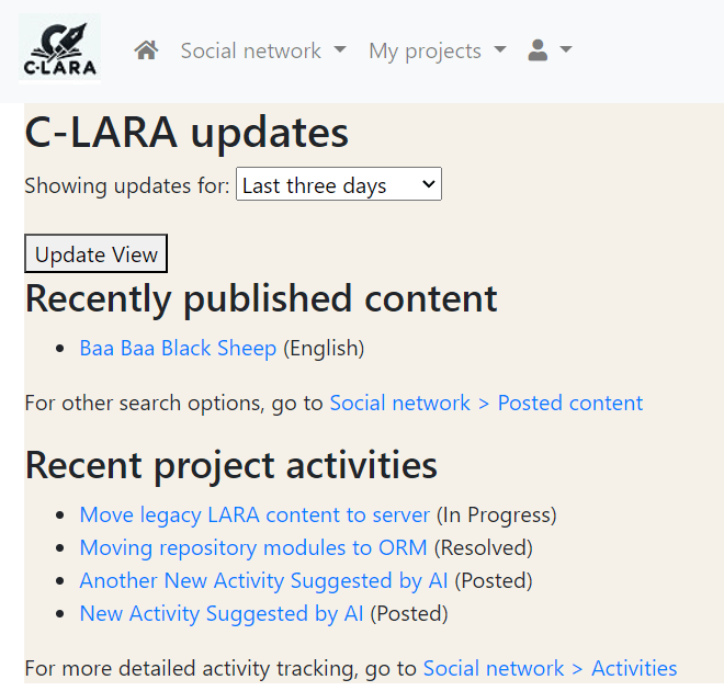
As you can see, the items have been moved around a bit. Following standard usage, the ‘Home’ icon is on the far left, and the icon on the far right has things like ‘User profile’ and ‘Logout’.
Layout
We have made some general improvements to the layout. There is now a background colour, and content is arranged in a tabular form. The following screen illustrates:
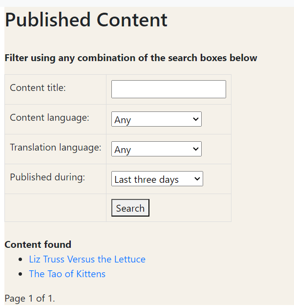
There are almost certainly screens left where the transformation to tabular layout has not yet been implemented, please let know if you notice one.
Ratings
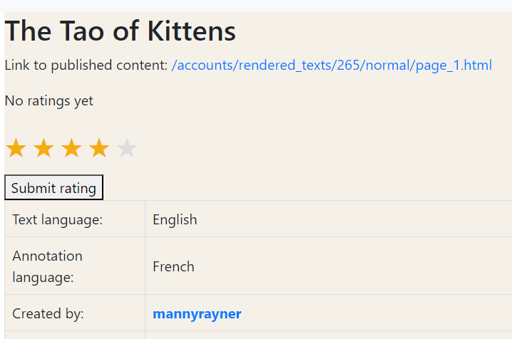
The most complicated thing we did was add a nicer interface for assigning a rating to a piece of text. The AI gets all the credit for this little piece of CSS magic:
Branislav and I are planning another session or two in the near future. If you have suggestions for further cleaning up, please let me know!

Leave a reply to mannyrayner Cancel reply